WHAT ARE
RESPONSIVE LOGOS?
Responsive logos are shape-shifting logos that change in
size, complexity or even colour to accommodate and adapt to wherever they are
placed.
Today’s trend now indicates there are more places to stick
your logo than ever before, and they all vary widely in size. The traditional
rule in logo designing “never change your logo” that had been tenet for
decades? Nowadays, it will hold you back.

Whether this is the first you have heard of responsive logos
or you are actively considering making one yourself, This article here serves to enlighten you
on why you need one for yourself or business.
LET’S
DIVE-IN!
You have probably heard the buzzword “responsive” a lot. The
term was originally coined to describe how a website adapts or “responds” to
different screen sizes. The goal is for websites to always appear at their
best—no matter whether on a desktop, tablet or mobile phone. More recently,
logos borrowed the word to describe their own size-shifting capabilities.
Truth is, “responsive” logos have been around far longer
than responsive websites, or even the internet!
Over the last century, companies have experimented with
different “contextual” logos to suit a specific location or print medium.
Sometimes companies drained the colour from their logo for black-and-white
newspapers. Other times they shrunk and simplified their logo to appear on
promotional pens. Alternatively, often they added more flourishes and
decorations for an impressive letterhead.
Even before smart devices, altering logos had practical
advantages. That’s not to say responsive logos should all be different from one
another. Instead, it is more about creating different versions of the same
thing and then optimizing them to better fit different contexts.
As marketing evolved, an idea took hold that your logo
should be consistent to increase brand recognition. There is truth to that idea
(consistency is important with responsive logos, too), but being so rigid about
changing your logo at all can become counter-intuitive. It makes more sense to
optimize your logo for its context than to copy-and-paste a logo designed for a
billboard on your tiny business card. To further explain, due to technological
advancement, and increase in more print medium, it will be unwise to print a
detailed logo on smaller medium, in which case digital compression is used
causing distortion leading to unrecognition. This is where “responsive” logo
thrives and provides the best option.
Thanks to the popularization of mobile devices and the
subsequent branching out of their screen sizes, brands started rethinking their
“never change the logo” mentality. That is precisely where we are at today:
what was seen as an advertising faux pas is now being recognized as a best
practice.
The advantages of responsive logos are obvious. Considering
all the different places a modern company needs to put their logo, it is
impossible to use the same version everywhere without losing a little something
here or there.
Digital
Screen sizes are a good place to start. The popularity of
mobile browsing alone necessitates the need for at least one alternative
version of your logo.
Lately we are moving past smartphones into even smaller devices: smart watches, smart bracelets, and soon smart glasses. If you thought your full-sized logo looked dapper on your phone, it won’t be long when it’s crammed into the corner of the screen in your AR app.
There are also tiny ads inside the tiny screens. Even
advertising on a desktop site, your ad is likely to be shrunk. That effect is
twice (or more!) as bad on mobile devices.
Outside the digital space, companies are exploring new and
diverse avenues for advertising. For traditional methods like promotional swag
(T-shirts, pens, bags, hats, etc.) you not only need to consider the size of
the logo, but also how it looks printed on different materials.
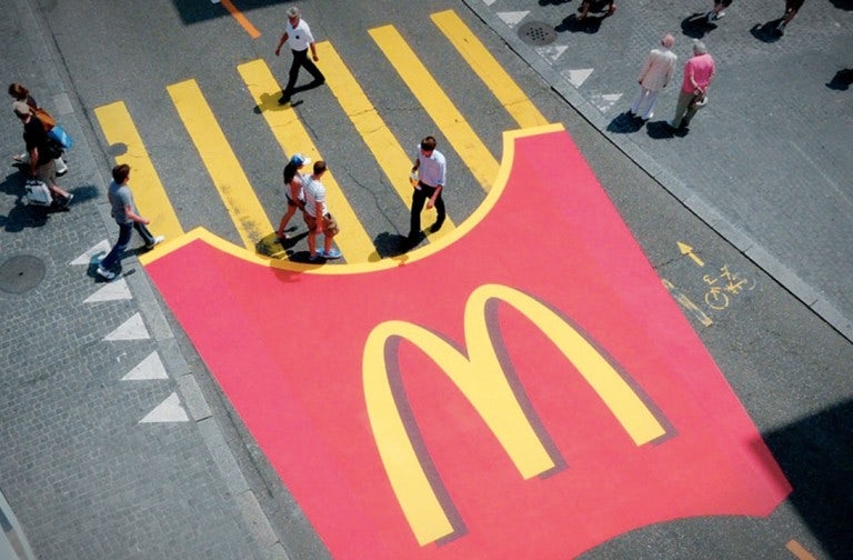
Also, consider the popularity of guerrilla marketing where
logos appear unexpectedly in public spaces, like graffiti murals in lieu of
billboards. In other words, even strictly non-digital brands need flexibility
in their logos.
Videos also allow a style of logo largely under-utilized
until now: animated logos. With more and
more companies branching out into video content—especially on social
media—brands in any industry can mimic the same motion effects that film studio
logos have used for decades.
Now is the time of responsive logos, for big and small
brands alike. Large enterprises are starting to capitalize on how well their
customers know their brands by experimenting with more simplified and abstract
variations—as long as there is enough of their classic logo to make it
recognizable.
Reference:
https://99designs.com/blog/trends/responsive-logos/

Comments
Post a Comment