How to
design a responsive logo in FIVE easy steps
1. Make at least four different versions
When you break down a responsive logo, you’ll find three or four different
versions of the same logo, varying in size and their level of detail. Keep that
in mind as you start experimenting with the format.
If you already know where you are going to use your logos,
you can model your four versions around those locations. If not, you can copy
the format used by the top name brands on the right.
Your first variation should be your master logo, containing
all the information you want to communicate, plus any extra frills you have
space for.
2. Add or remove details as you scale up
or down
What’s the difference in the four versions outlined above?
If you are familiar with responsive web design, you already know that designers
add details as the screen size scales up, and remove details as it scales down.
It may help to prioritize the elements of your logo
beforehand. For example, low-priority elements like a slogan or an
“established” date are good additions when you have plenty of space, but should
be the first to go, as you get smaller. Higher-priority elements like the
company name should remain for as long as possible, but it is hard to justify
their necessity at the smallest sizes.
It is not just about getting rid of elements, but about
reducing their level of detail. Similarly, you can also reduce the amount of
colours to simplify your logo. Colours can be hard to see at smaller sizes, and
if you have too many, the design becomes too busy and distracting. When it
comes to designing responsive logos at small sizes, simplicity is key.
via designerpeople.com
3. Stay
consistent
One of the biggest misconceptions about responsive logos is
that each version should be a new logo all together. The truth is, as we, said
above, responsive logos are different versions of the same, original logo.
Throughout each version of your responsive logo, keep common threads to link
them altogether. Be consistent with font and color scheme through each logo
variation. These elements are innately tied to your branding as a whole, not
just your logo.
That is not to say that you cannot modify these elements at all. Considering the restrictions of small logos, feel free to simplify your typography or color usage while remaining consistent enough with the original.
 |
| In two different versions of the 3Brothers logo, the font, color scheme and texture effect remain identical, even though the structures are very different. Logo design by blink3moi |
4. Use
abstract symbols at smaller sizes
Sometimes when designing smaller versions of your logo,
you’ll run into a wall where too much of the original is lost. If that’s the
case, don’t force it! Some design can’t be simplified (and looks awful when you
try). A smarter alternative is to use a new symbol to represent the original.
 |
| via 99designs.com |
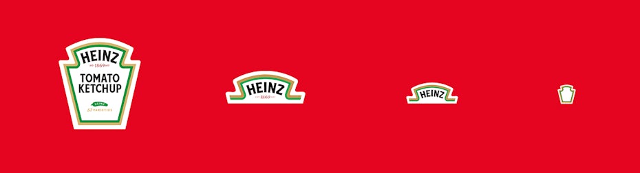
Heinz does this well, taking advantage of their label’s
unique abstract shape by fusing it with their logo. While they use the
traditional method of removing details for the first three versions, the final
version is simply the distinct shape of their label with the familiar color
scheme to improve recognition. Because they’re a household name, their customers
have no trouble recognizing the Heinz logo without words.
Just remember what was said above about consistency; the
more visual cues you include, the more easily people will recognize you.
5.
Strategically use stacking and rearranging
Responsive logos are not always about bigger or smaller. By
definition, responsive logos are meant to “respond” to different circumstances;
usually size, but sometimes how they fit together with the surrounding area.
For some logos, you can achieve more flexibility in how you
stack your elements, such as text. Rather than removing elements altogether,
you can achieve the same space-saving effect just by reorganizing where
everything goes.
See what we mean in the four B&O logos on
the below. If the company opts for digital banner ads, their logos are optimized
no matter if the banner is vertical or horizontal. On top of that, they also
have a perfectly plain logo for when neither of the other options work.
When designing a responsive logo, consider rearranging as an
option alongside merely removing elements. In some cases, smart planning can
allow you to retain crucial parts of your logo at smaller sizes, so you have
your cake and eat it, too.
 |
| via gm-design.co.uk. |
Responsive
Logo is the ‘New normal’
Sure, having a single logo is easier and more convenient,
but the more marketing channels that open up, the less effective that one logo
will be. Responsive logos are about having the perfect tool available, no
matter what the job is.

Comments
Post a Comment